🔥Teens Want a Mindset to Thrive & Confidence to Lead 🌟
✅ Join To Build Teen Leaders
Teen Empowerment Training
🌱For Teens Ready to Grow Stronger, Wiser, and Bold
🚀 For Teens Ready to Lead with Confidence and Clarity
💡 Mindset. Strength. Leadership.
Unlock the tools, support, and skills to take control of their future, communicate with clarity, and lead with purpose.
🎓 3 Life Skills Training Lessons Watch & Share!💥
Looking for more than screen time?
Give Your Teen the Gift of Leadership and Lasting Confidence!
Help develop a powerful mindset, build social confidence, and
thrive in a supportive, small-group environment.
This unique program combines live mentorship, a caring community, and essential life skills to guide your teen toward meaningful personal growth and success.
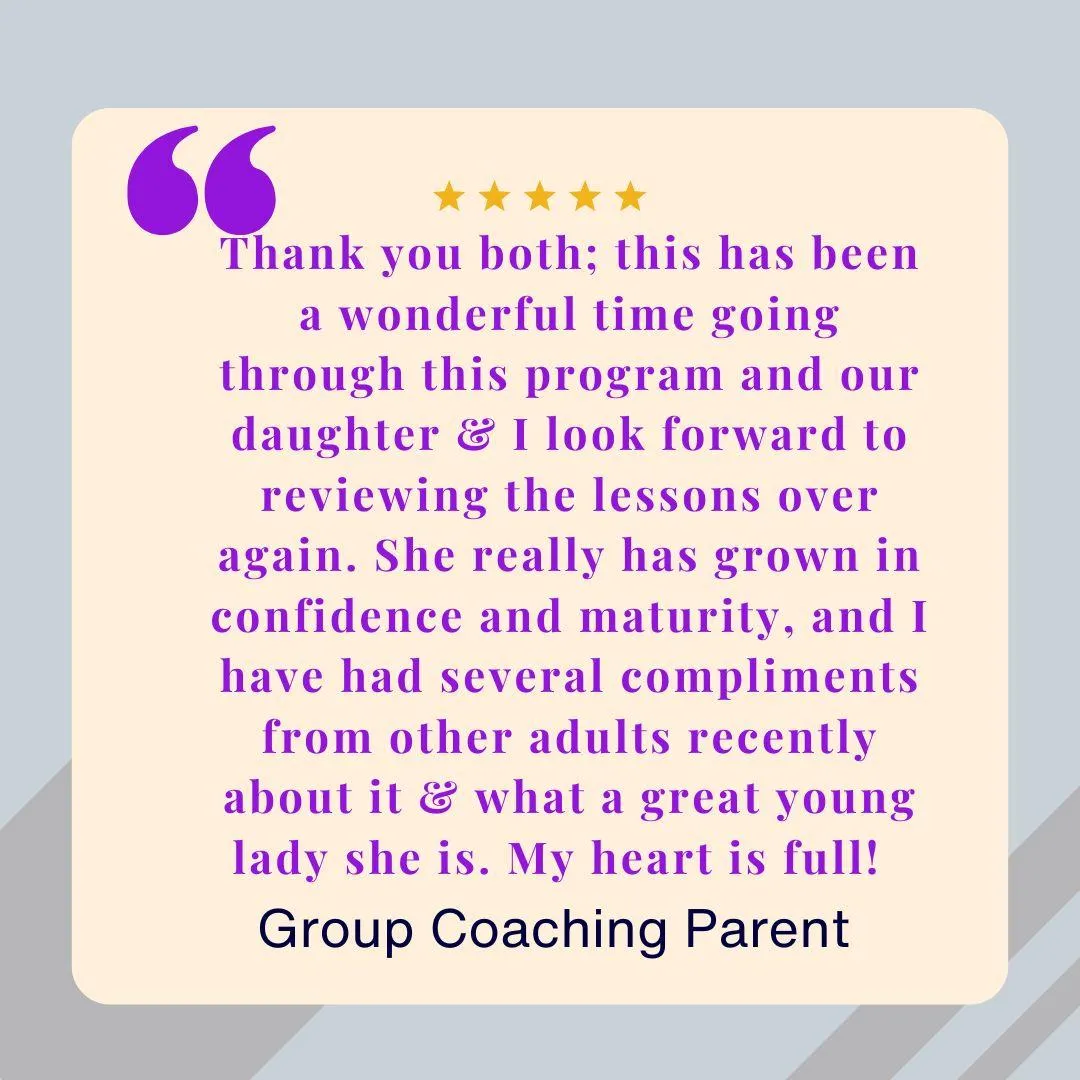
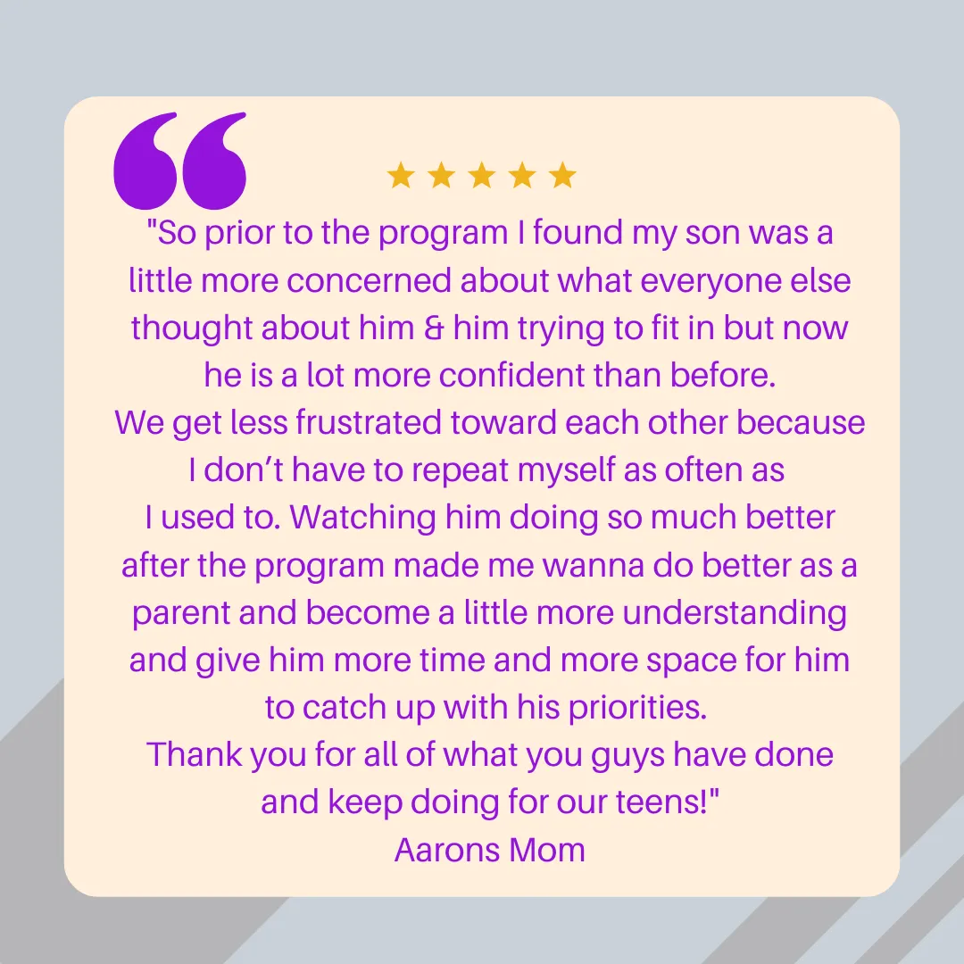
Why Parents & Teens Love It:
✅A trusted, guided environment for self-discovery
✅Supportive peer community and built-in accountability
✅Parent involvement without overwhelm
✅Real progress, visible confidence shifts, and lasting change
🌟 Teen Empowerment Coaching Programs
Empowering Youth Ages 11–17 with Confidence, Leadership, and Emotional Strength.
What if your teen could trade self-doubt for self-leadership in just 90 days? With our Teen Empowerment Programs, they’ll build unshakable confidence, real-world life skills, and receive personalized coaching all designed to help them rise with purpose and live a life full of meaning.
🔥 TOP TIER: Family Training
24 Lessons & 12 Coaching
Sale Price One-Time $3,150
Monthly Option $525 x 6
• 12 Private 1:1 • Coaching Zoom & Chill & 2 Family Calls.
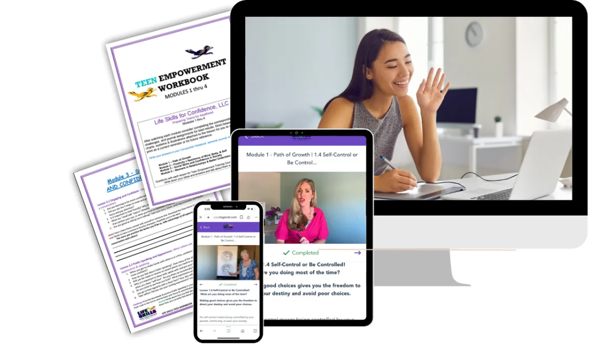
• Online Training + Workbook for 4 Modules (24 lessons).
• Weekly Group Coaching Students
• Unlimited Parent Messaging & Support
Original Price $4,095
⭐ Growth & Guidance:
Family Training 6 Lessons
Sale Price One-Time $260
Monthly Option $260 x 1
• Online Training + Workbook for 1 Module (6 lessons)
• Weekly Group Coaching
• Monthly Family Check-Ins
• Email Support from Coaches
Original Price $340
✅ Confidence Starter
Family Training & 1 Coaching
One-Time Sale $520
Monthly Option $260 x 2
•1 Private 1:1 Coaching Session
• 1 Online Course Training
• Weekly Group Coaching
• Downloadable Teen Workbook
• Parent Guidance Emails
Original Price: $
Group Coaching: Rewire and Rise
Sale Price One-Time $525
Monthly Option $175 x 3
• Training Course Access Monthly
• Weekly Group Coaching Sessions X4
• Monthly Parent Q&A Calls
• Goal Setting Templates
• Certificate of Completion
Original Price: $683
Teen Empowerment Self-Paced Lessons & Course
Sale Price One-Time $1,050
Monthly Option $350 x 3
• 24 On-Demand Video Lessons
• Self-Guided Workbook
• Mindset & Confidence Tools
• Access Anytime for 12 Months
• Easy Start Guide for Teens & Parents
Original Price $1,500
Confidence Starter
$0
• 3 Free Video Lessons
(Feelings, Choices, Independence)
• Intro to Our Method
• Email Guidance
• No Credit Card Required
• Option to Upgrade Anytime
Original Price $188
🔥 Empowerment Course & Coaching- For New Coaches
Sale Price One-Time $3,000
Monthly Option $500 x 6
Private 1:1 Coaching — Personalized training for new coaches to be successful
• 24 Online Video Lessons —
Complete course with companion workbook & teacher guide
• Weekly Group Coaching —
Ongoing support and community learning
• Unlimited Messaging & Support —
Direct access for questions, guidance, and encouragement.
Original Price $4,285
⭐ Empowerment Course
Growth & Guidance- For Teens
Sale Price One-Time $1,050
Monthly Option $350 x 3
• Full Online Course + Workbook
• Weekly Group Coaching
• Monthly Family Check-Ins
• Email Support from Coaches
Original Price $1,365
✅Empowerment Coaching
For Teens
One-Time Sale $175
Monthly Option 1 × $175
•1 Private 1:1 Coaching Session
• Online Course Access
• Weekly Group Coaching
• Downloadable Teen Workbook
• Parent Guidance Emails
Original Price: $228

FOLLOW US
COMPANY
CUSTOMER CARE
LEGAL
Teen Empowerment Training - Part of Life Skills for Confidence
PO Box 13 Queen Creek, AZ, USA @ 2019 All Rights Reserved


Teen Empowerment Training Course Online
5 Key Elements for skills
Are daily conflicts and challenges with your teen or tween creating heartaches? These moments often highlight areas where they need critical life skills to thrive.
Most parents try to change their teen's behavior, but the real issue often lies in underlying feelings of self-doubt, fear, and uncertainty. Addressing these can lead to significant growth.
Don't Give Up - It's Not Too Late! Empower your teen with the skills they need to become confident leaders and future entrepreneurs
Turn frustrations into opportunities for positive change and watch them flourish!
